
This is the NME contents page, they have one main image on the page. Their logo is featured at the top along with a 'contents' heading. This seems to be a recurring theme within contents pages. There are bigger pieces of text which seem to be from the editor, along with page numbers and various headings suggesting that there is 'news' (surveillance is one of the reasons people read print NME seem to be using this to their advantage with various different headings) 'radar', 'reviews', 'live' and 'features'. Sub headings are also something thats cropping up alot with in contents p
Contents Pages;
Billboard- The Billboard Contents page is bright and colourful the text is funky which all reflects the type of music the magazine contains. The use of a top charts on the contents page also shows us the type of music the articles will be about. The images are all of relevant pop singers; this entire contents page says ‘pop music’.
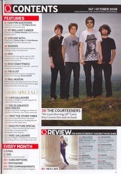
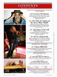
Q magazine- The Q magazine contents page has photos of relevant pop artists just like Billboard, the contents is all down the left hand side. However again just like the front cover of Q the contents pages colours are a bit dark and more professional which will appeal to a wider audience. They also have a customer sense of recognition as they have an 'every month' section which lets the audience know they are getting routine feat
Rolling stone- The contents of rolling stone has images all down the left hand side and a well layout contents on the other side this creates a professional young look. The font and colours used go well together and make an attractive effective page.

 RSS Feed