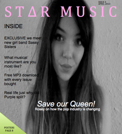
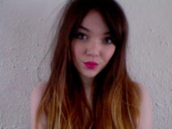
This is the front cover for my music magazine. The mast head reads 'Star music' this identifies my magazine as a music magazine it also gives my magazine a brand so if my audience want to buy it again its easily recognisable. The pink and green splash of colour over the black and white background presents the magazine as a pop music magazine, as does the picture (reasons in the post before). The black and white effect on the picture i believe makes the product look more professional. I have used the typical convention of the left hand side so that when my product is on the shelf it can draw attention without having to be picked up which may be some hassle for the consumer. Rosey is looking at the camera which makes the consumer think they are important which will attract the buyer. As of yet my product doesnt have a bar code however this will be corrected.
 RSS Feed